

SuperWorks

Brand identities, design systems, and hand-coded sites across three years of agency client work.

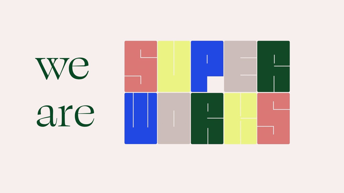
SuperWorks “we are” brand-identity mark

Role

UX designer

Team

Creative director

Engineers

UX researchers

Graphic designers

Clients & stakeholders

Timeline

3 years (2022 - 2025)

Overview

Showcase of some highlights from multiple client projects at SuperWorks, a Bay Area design agency.

Website Design

My final prototype that was developed
The Urban Field horizontal-scroll website as one continuous strip of pages
Horizontal scrolling website I designed. Drag the yellow frame to explore it.

Branding & Graphic Design

My visualization of the visual identity creation process

Stage 1

Finding common themes in the client's business

Urbanism
Advocacy for public spaces
Community building
Urban nature

Stage 2

Proposed metaphors that describe the work

Transit map

Selected metaphor

Toy building blocks
Flight departure signage
Wheels & cyclical motions
Index cards

Stage 3

Selected concepts

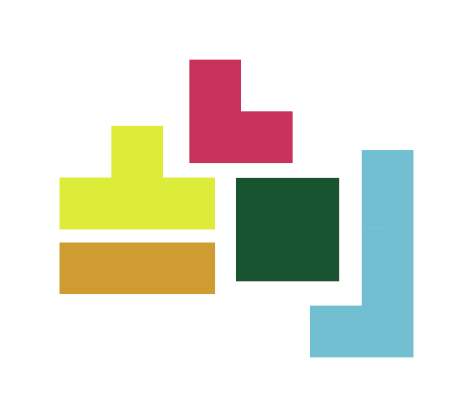
Colorful toy-building-block shapes
Building blocks
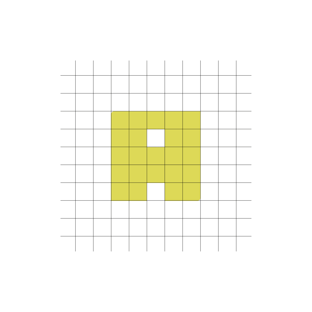
An index-card grid
Index cards

Stage 4

What I delivered

Building-block letterform on an index-card grid
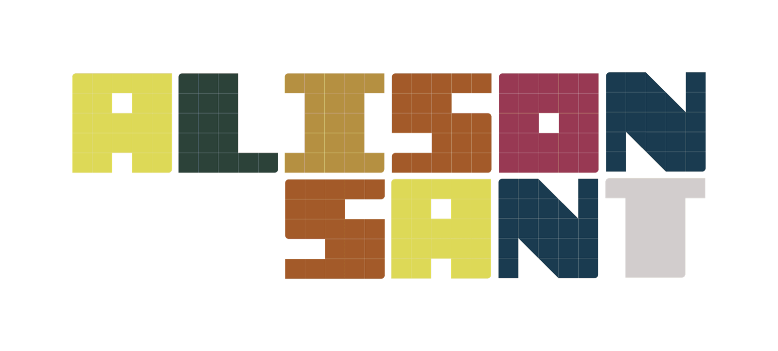
Combined concept
The Alison Sant building-block wordmark
Logo
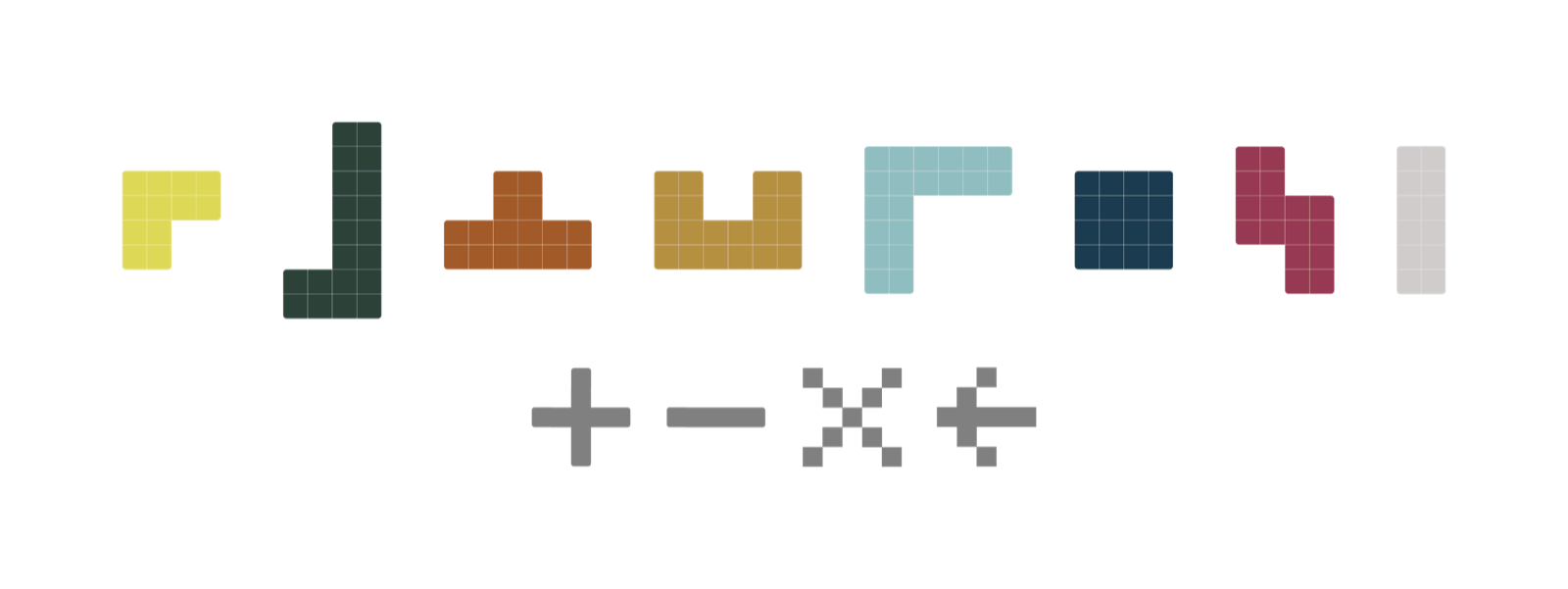
Supporting building-block icon set
Icons
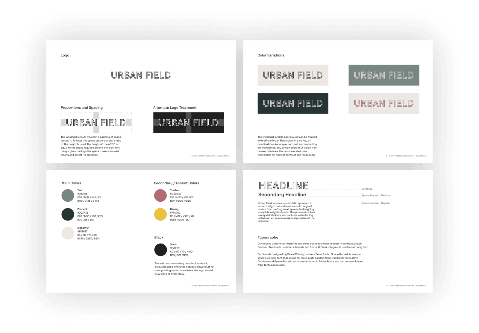
Urban Field brand guidelines spreads
Highlights of the brand identity pages I made
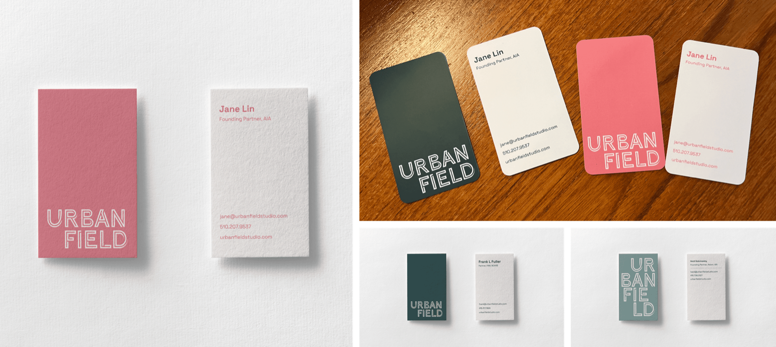
Urban Field founder business cards, printed and collated
Business cards for the founders that I designed
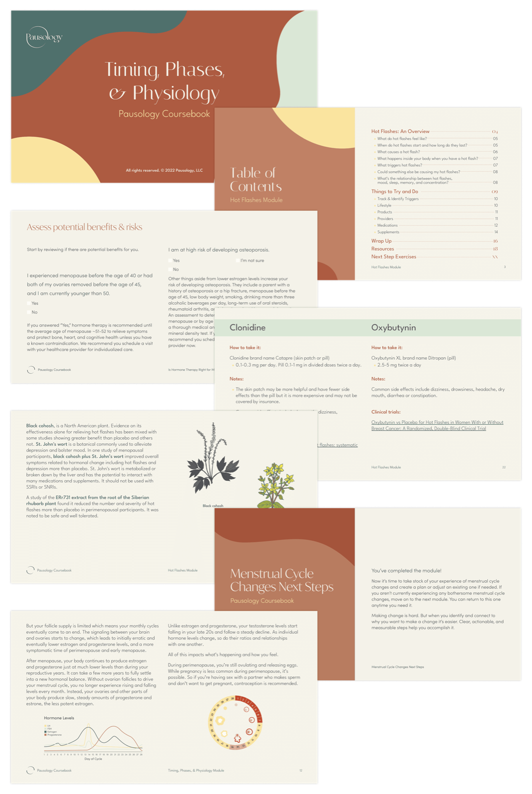
Selected pages from the course book
Spreads from the 350-page Pausology course book
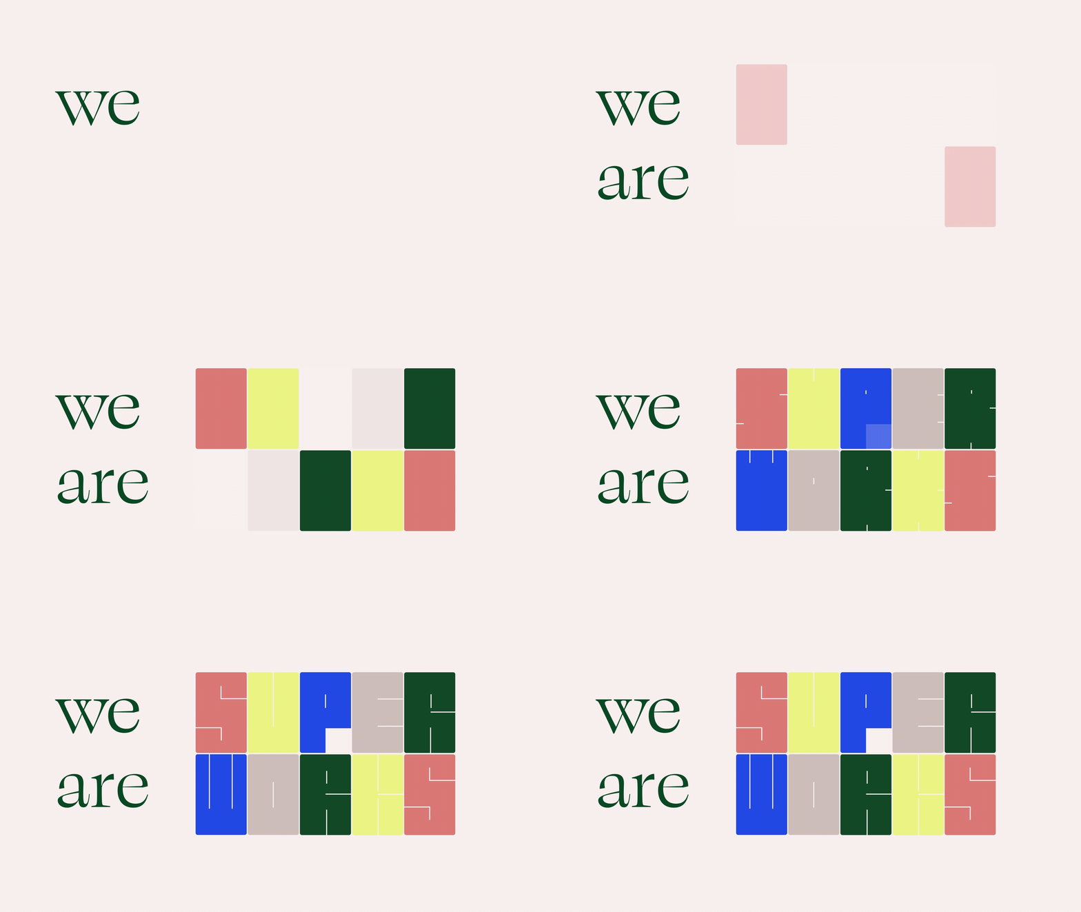
SuperWorks “we are” animated logo with toy-building-block letterforms

Next up